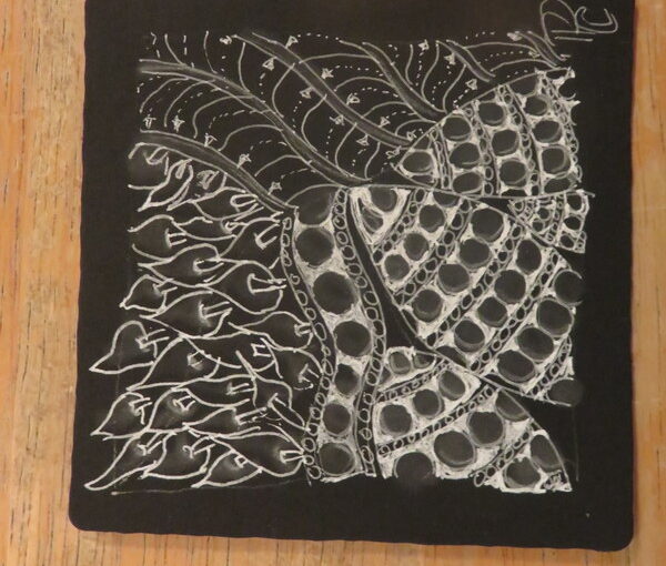
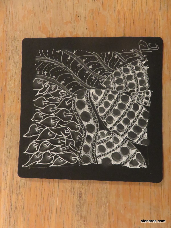
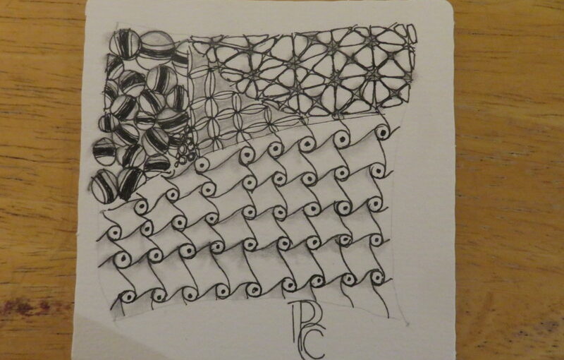
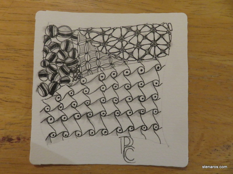
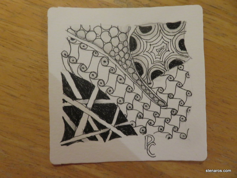
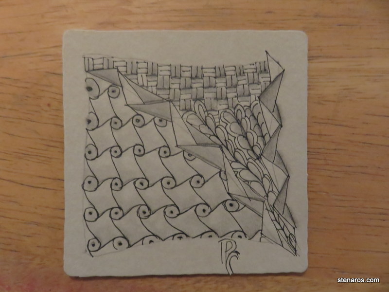
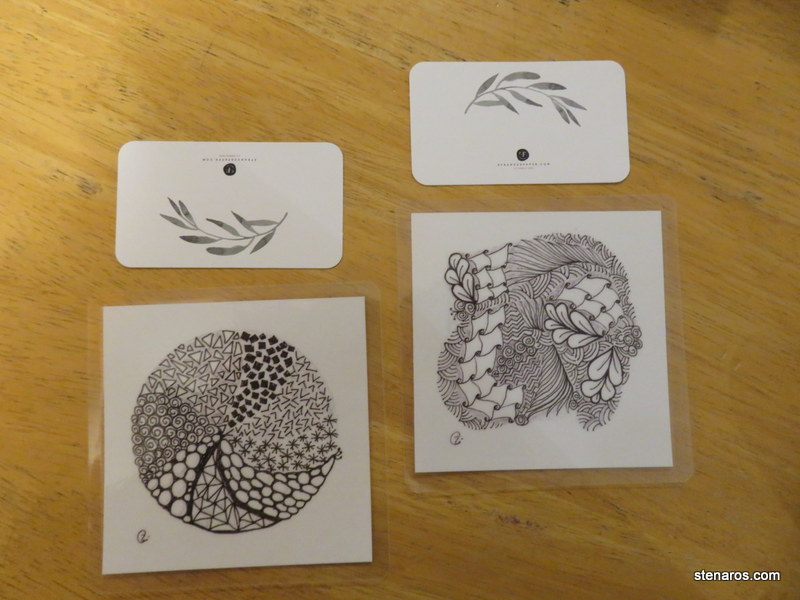
I really enjoy that scroll one. It’s simple repeated movements that come together into something cool. (Which is a nice summation of Zentangle, in general.)
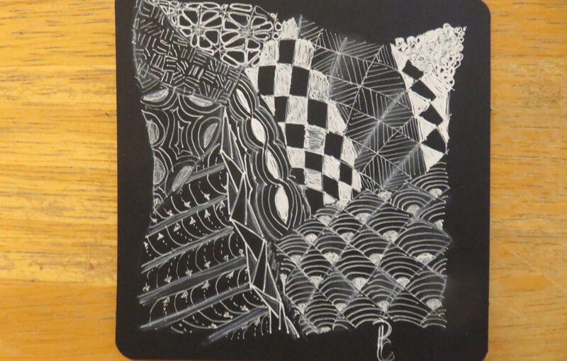
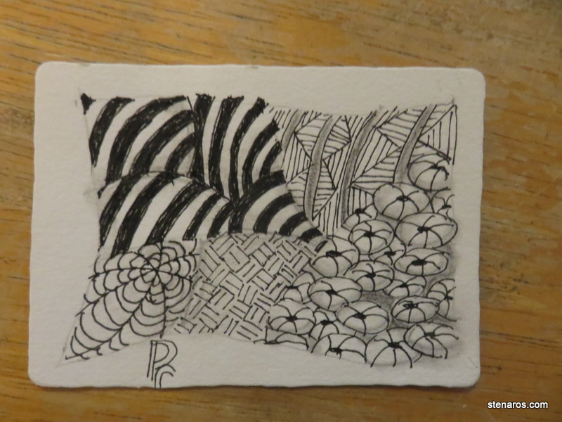
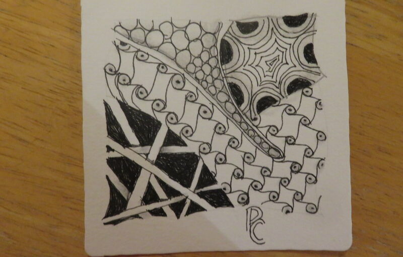
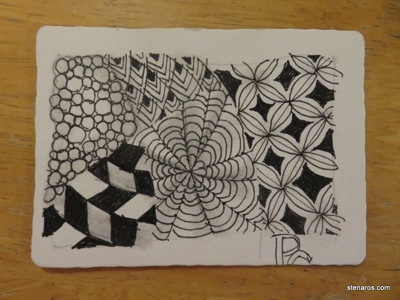
When looking at these close up, it’s easier to see that I’m not really a fan of filling in spaces. I get distracted and the pen goes outside the lines as in the stairstep one, or I don’t completely fill up the black space, like the one on the right.
It’s not so visible in real-size though.
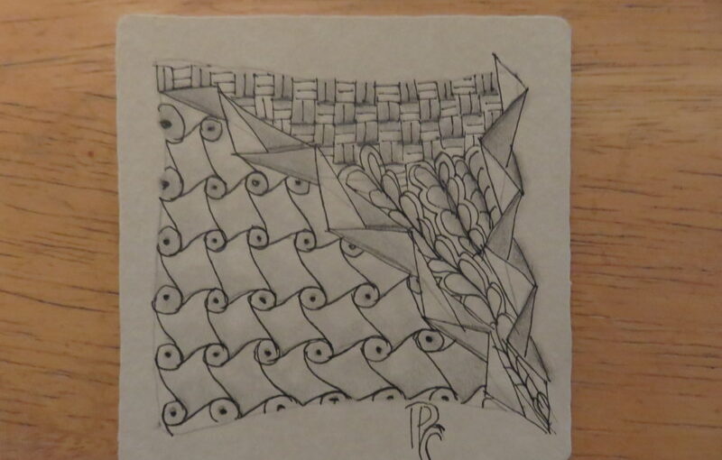
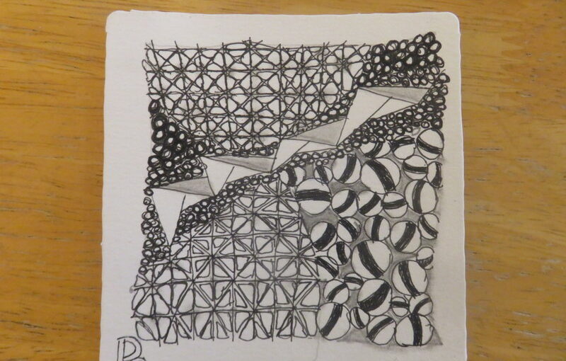
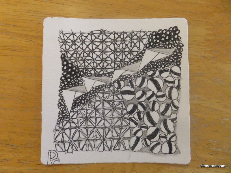
When in doubt, use tipple! That’s the tiny circles on the top on this one.
It reminds me of that Mr. Rogers (I think) segment where they filled the jar with marbles and then sand and then water to show that when you think something is full, it’s not. (Quick googling to see if I could find the segment has told me that this has become a priority metaphor. Which, fine.)
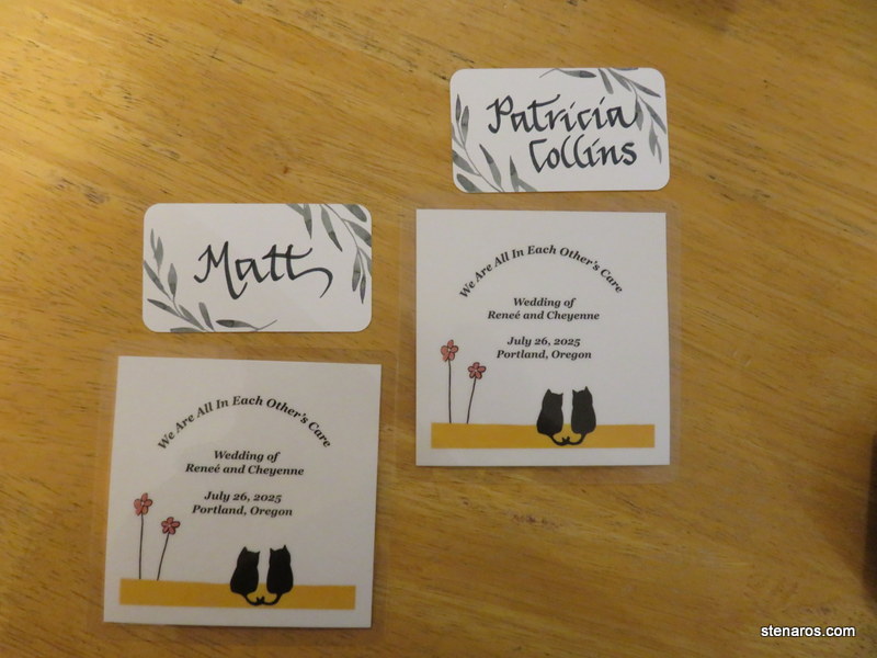
We each had hand-lettered place cards, and got to take home a coaster. The cats on the coaster are smitten kittens, which is what Cheyenne’s daughter called Cheyenne and Renee.
As we went to our table Matt said, “Look, it’s that drawing thing you do!”
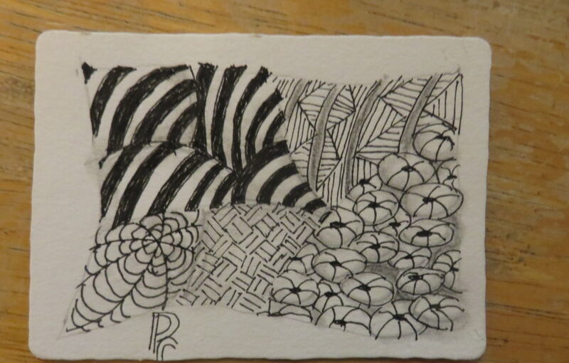
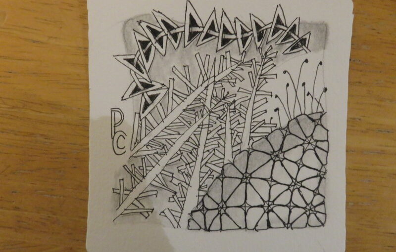
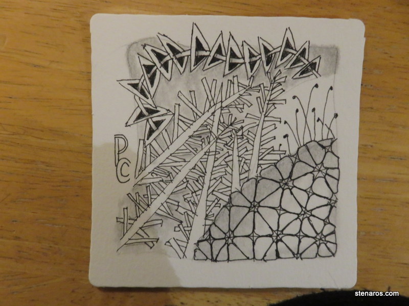
That tangle in the lower right-hand corner is called ‘Nzpple, and when learning it, I was told it would really pop when done. I very much doubted that would be the case as I worked through it, but when I was finished, pop it did!