Lighting update: we now live in the future

The entire 10+ years we have lived in our house, our porch light has not functioned very well. When we flip the switch, the light comes on about 15% of the time. We eventually stopped flipping the switch. We live on a major street. It is not at all dark on our front steps. Calling an electrician to fix the problems was very far down on the list.

I contemplated installing a motion sensor light, but that was also quite far down on the list. Luckily, technology caught up with my needs.

The light that is coming from that porch light is an LED bulb that has a motion sensor built in! All I had to do was screw the bulb in, flip on the light and wait for it to get dark. It now turns on and off automatically. This was the best $12 I have ever spent.

Biking update: paying for supplies

When I started biking to work again, I needed to invest in some bike-worthy clothing for the winter months. While getting to work via bike is much cheaper than via car, it does have its costs. The trick, as with all saving money things, is to keep them below the cost of other ways to get to work.

(The only thing cheaper than bike riding would be walking to work, as it only requires a decent pair of shoes and something to keep the elements out. It does take substantially more time, though.)

In my case, I can pay $5 per day to ride the train round trip, or I can bike and pocket the cost of the commute. When I make a big bike purchase, I like to see how long it takes to pay it off. This keeps me in economical bike gear as bike jackets can be very expensive.

While I was riding to pay off my bike gear, someone stole my bike light and I had to pony up 6 more days of biking to break even on that.
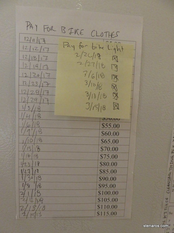
I spent $115.00 on gear. Here’s what I bought:

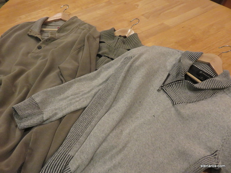
At Goodwill, I went to the men’s section and bought three sweaters/sweatshirts. I was hoping for wool to keep off the rain, but no wool sweaters were to be found. I also bought four long-sleeved long-johns-type shirts for a base layer. Also, because my job involves walking to the bank to deposit checks, and not wanting to wander the city in my biking outerwear, I bought a second work coat to leave at work, which cost $30.00. Goodwill in Portland tends to be a rather expensive endeavor, considering it’s all used clothing that are donated.

My plan was that I would have the base layer and the heavy sweater and that would be enough to keep me warm. When it rained, I would use my bike poncho. However, I forgot something important: pockets.

Unless it is very cold (which doesn’t happen very often in Portland, even in the winter) I start my commute wearing those small stretchy gloves one can buy at every discount store in the winter. Halfway through the ride, my hands warm up and I take off the gloves and shove them in my pockets.

No pockets meant I lost some gloves, because they fell out of my basket. Also, I wasn’t adequately lit, which meant bringing along a reflective vest which was yet another layer to put on and take off.

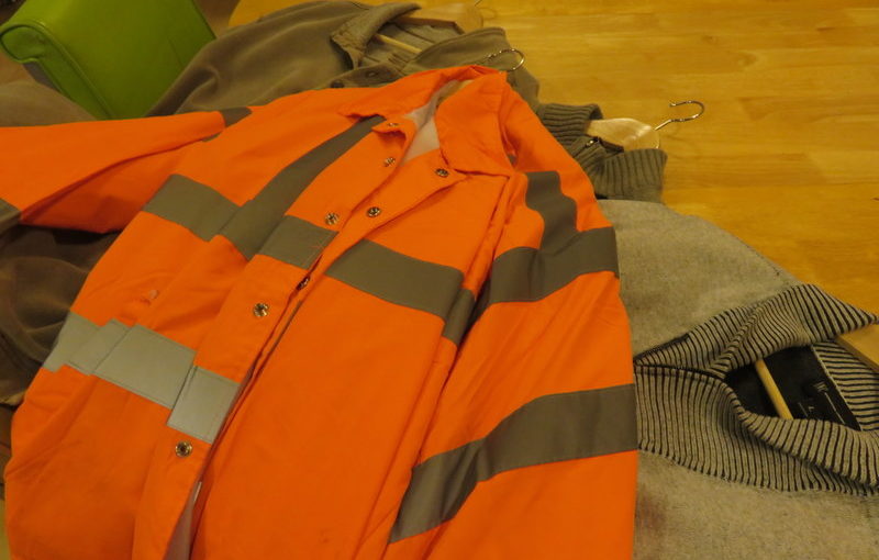
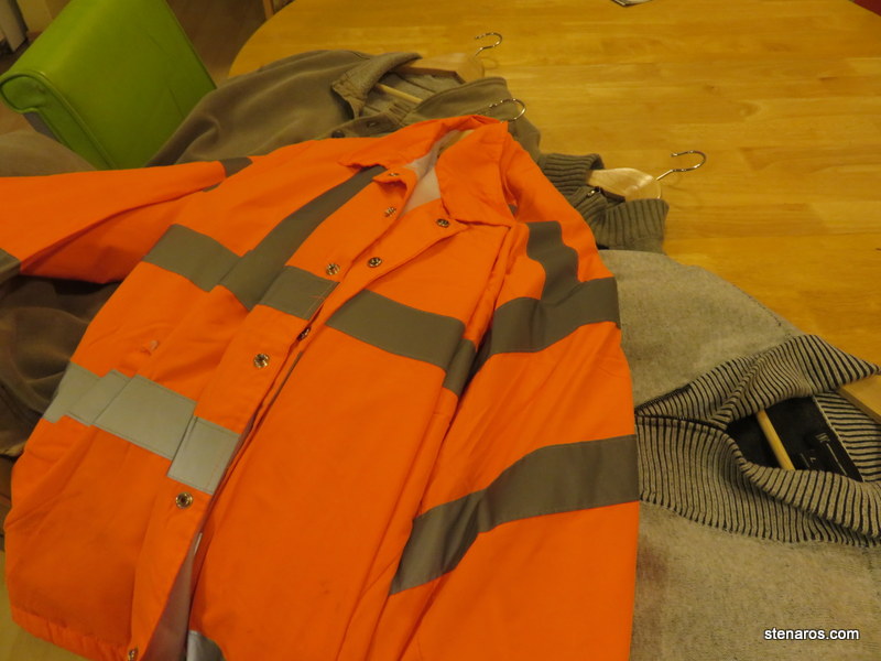
So I had to pony up some more cash and return to my trusty affordable jacket to wear while biking (as opposed to a bike jacket.)  The orange monstrosity you see, is a flagger windbreaker. I previously had one in yellow, which I wore for many years. I was very excited to see that now I had the option of orange. This jacket costs around $40, is a nice layer against rain and cold, is obnoxiously reflective and also has pockets. I recommend such a jacket to all economical bike riders. In fact, I wish more people would wear them because I feel 20% dorky in mine and if they were more ubiquitous, that feeling would probably fade.
As the winter wore on, I realized I had overbought. I could have easily done with two sweaters and two base layers, which would have reduced my cost by about $20.

Overall, I’m happy with my biking clothing choices and feel that they served me well during the cold season. I’m looking forward to using them again next year, when they will be “free” to use.

Of note: I don’t factor in the cost of annual tune-ups to my bike commute costs. My tuneup this year cost $250 which means it would take 25 weeks of twice-per-week biking to pay it off. That’s too depressing to think about. I’m going to have a bike even if I don’t commute to work via bike, so I’m looping annual tuneup price into my “general vehicle expenses” category.

Three sentence movie reviews: Meet me in St. Louis

There are so many delightful moments in this movie, especially if you skip the super bizarre Halloween scene.* I especially appreciated the sets and costumes, which Technicolor showed off perfectly. The family interactions are what buoys this movie, and the songs are delightful.

Cost: free from library
Where watched: at home, as part of Filmspotting’s Minnelli Marathon.

*What the heck is going on there? Aside from all the children making huge fires and hazing other children, was it considered a good thing to get flour thrown in your face by a small child?  If not, why even answer the door?

poster from: http://www.impawards.com/1944/meet_me_in_st_louis.html

Lizzy Acker is my new favorite reporter for the Oregonian

I initially took this picture because I’m pretty sure when that couple on the right married 75 years ago, they had no idea that their long marriage would someday be featured in the newspaper next to a workout involving pole dancing.

The story about the married couple was great, and also so was the article about pole dancing as exercise. Check out Lizzy Acker’s first three paragraphs.

And also the last four paragraphs.

Aside from general reporting, which she also seems to do, Lizzy Acker does oddball series. This is part of her week of weird workouts series. She’s also done an extensive review of black leggings; seven days of living like a kid in Oregon; and going dancing every night for a week in Portland.

In all these articles she brings a fun zing and some thoughtful weight to her words. I look forward to reading more from her.

New game: The Fog of Love

Matt has purchased a new game in which a two people play a couple in love faced with challenges and difficulties. The goal is to navigate through the difficulties and win by finding true love.

Overall, I found this game fun, though I really hated the blue/pink color scheme. Any other two colors would have worked well. For the first game, I was Ken, a TV Star with a booming voice. Matt and I did not find true love and lost the game, but we are willing to try again. Though Matt will never repeat the mistake of giving me the Booming Voice card. My voice can be quite loud.

One of the best things about this game was that the tutorial was built into the first game. The game designers gave you enough information to understand the part that you were on, and then as game play progressed, another tutorial card would appear explaining what was going to happen next.

As someone who has sat through a lot of really bad explanations of how to play games, I found this to be one of the greatest board game developments since Lizzie Magie invented the game that would become Monopoly.

SKS Postcard: Lars Lerin’s Birch Forest


Sara reports that she is enjoying the weekend before spring break and also that she doesn’t know where she picked up this postcard (which is very large for a postcard)  I’m thinking she got it in Norway, because the actual name of the picture is Björkskog/Birch Forest

Fun fact: I just learned how to make that “Latin small letter O with diaeresis”  You type &#246 and it changes automatically.  Magic!  Thanks, random website I found while googling.

Three sentence movie reviews: A Wrinkle in Time

My re-read of the book last year was fairly “meh” so I didn’t have a lot of high hopes for the movie. And while it was visually stunning and populated with good acting, I found that overall the movie was lacking in things that were super engaging. The boyfriend summed it up best: “It’s a movie about watching children experience wonder, and that makes for a boring movie.”

Cost: $6.00
Where watched: McMenamins St. Johns Theater with Matt.

poster from: http://www.impawards.com/2018/wrinkle_in_time.html

Hot tip: use your double timer to your advantage

One of the annoying factors of baking cookies is having to turn the cookies halfway through the baking time. If I’m using the oven timer I have to remember to reset the timer. It’s not unusual for me to forget this, usually on the last round of cookies.

However!  I now have this timer that can have three different times running on it, and it occurred to me that I could set the top timer for half time and the second timer for the full time and then start them both at the same time. Then, as I’m rotating the cookies, that second timer just keeps counting down. Brilliant!

A new era for Vanity Fair

I was reminded by editor Graydon Carter that this was his last issue of Vanity Fair. It took me a long time to read this issue. It was so long that the new issue appeared on the racks at the checkstand before I had finished reading this one. “Whoa!” was my reaction. The new issue has a completely different look.

Let’s review the Graydon Carter era style.

This is the classic Oscar Issue, where the page folds out to show a variety of big Hollywood actors, some of which have not been nominated for Oscars, presumably because they shoot the spread earlier than the nominations are announced.

We’ve got full-body spreads, and floating type. A quick Google Image search of “vanity fair covers” shows that while there are some face-only covers, most of them are either from the navel up, or full body shots. There’s also a bold use of color and lighting that makes things crisp instead of arty.

I also love finding the tiny type quote on the front of every cover. This one says: “One may understand the cosmos, but never the ego; the self is more distant than any star.” –G.K. Chesterton. The quotes sometimes add extra illumination to the person on the cover, or a story listed on the cover.
Here’s the new cover, with editor Radhika Jones at the helm.
It’s so very different!  Even though (I’m pretty sure) it’s taken by the same photographer. We’ve got a very close-up picture of Lawrence’s face, a very soft focus and half in shadow. Our floating text has disappeared, herded over to the sides of the cover. Compare this picture with the last time Jennifer Lawrence was on the cover in 2016.

This new cover was simultaneously off-putting–it’s Vanity Fair, not an art magazine!–and also instantaneously made the old style of covers look really garish and out of date. I’ll probably settle into this new style, but I will miss hunting for the tiny quote on the cover.

Side note: it used to be that when I was subscribed to magazines, my subscriptions would arrive before the magazine appeared on the newsstands (or, since there aren’t really newsstands anymore the racks in the checkout line at the grocery store.) Now, I see the new issue on the stands sometimes two weeks before my copy arrives in the mail. I can’t tell if this is just a Vanity Fair thing, or if there’s some new magazine strategy wherein magazines are hoping subscribers will purchase the magazine forgetting it will be arriving in the mail. At any rate, I think subscribers should be rewarded by having the first crack at the magazine, not have to be the second-class citizens waiting.